Adding Social Buttons to Item Pages
- Jonathan Tew
- Former user (Deleted)
- Perry Tew
. This page shows how to add Facebook, Pinterest, Twitter, and Google+ buttons to a catalog page.
Adding Social Buttons to Item Pages
The UltraCart catalog makes it easy to add a variety of social media buttons to your website with easy to use velocity code.
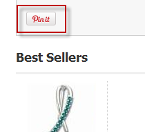
${item.getPinterestPin()} <br/><br/>
Place the velocity code into your item template exactly where you want the Pin It button to appear. The picture below provides an example of how it will look on a catalog.
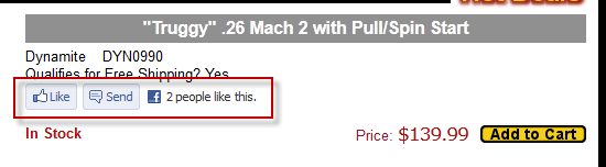
The Facebook Social Plugin allows for a variety of customizations to the appearance of the "Like" or "Recommend" buttons. The first, and easiest, way to include a Like button on your page is to simply call the method with no parameters.
${item.getFacebookLikeButton()} <br/><br/>
This will render the button using Facebook's default settings, as shown below.
If you want complete control of the appearance of the Facebook Social Plugin, you will need to use the more advanced method. Each parameter is described in detail below.
${item.getFacebookLikeButton(String layoutStyle, int width, boolean sendButton, boolean showFaces, String verb, String colorScheme, (Optional) String font)} <br/><br/>
- layoutStyle - there are three options.
- standard - displays social text to the right of the button and friends' profile photos below. Minimum width: 225 pixels. Minimum increases by 40px if action is 'recommend' by and increases by 60px if send is 'true'. Default width: 450 pixels. Height: 35 pixels (without photos) or 80 pixels (with photos).
- button_count - displays the total number of likes to the right of the button. Minimum width: 90 pixels. Default width: 90 pixels. Height: 20 pixels.
- box_count - displays the total number of likes above the button. Minimum width: 55 pixels. Default width: 55 pixels. Height: 65 pixels.
- width - How wide the control should be on the page. Make sure to reference the above layout styles for recommended widths
- sendButton - Set this to true if you want Facebook to include the "Send" button, otherwise set it to false.
- showFaces - If you set this to true, Facebook will show thumbnails of the profile photo for those people who liked your page.
- verb - The verb to display in the button. Currently, Facebook only allows either "like" or "recommend" in this field.
- colorScheme - There are two allowed color schemes, "light" and "dark". Dark is recommended if your page background is a dark color. Light is the default value.
- font - By default, Facebook renders the the widget differently depending on the what browser and operating system the visitor is using. If you wish to override this behavior, you can use one of these values: 'arial', 'lucida grande', 'segoe ui', 'tahoma', 'trebuchet ms', 'verdana'. If you do not want to override this behavior, simply leave out this field.
Whew! Now how about some examples? First, if you wanted to create a button with all of the defaults, you could use this.
${item.getFacebookLikeButton("standard", 450, true, true, "like", "light")} <br/><br/>
This will render exactly the same as the default. What if we want it to look like this?
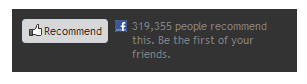
We would use this code:
${item.getFacebookLikeButton("standard", 250, false, true, "recommend", "dark", "trebuchet ms")} <br/><br/>
As you can see, there is a tremendous amount of flexibility in how you can configure the Facebook Social Plugin, so feel free to experiment. You can include more than one Like button on the page, so you can easily test different settings.
Facebook will automatically crawl your page whenever a visitor clicks on your like button. If you want to suggest content to Facebook to be included in the like, you will need to use the OpenGraph meta tags. You can read more about OpenGraph on Facebook's developer site. Actually, you'll probably find our documentation about the Open Graph protocol more useful.
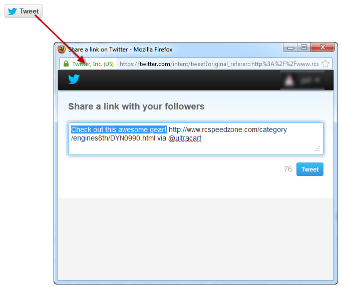
Like Facebook, the Tweet Button allows for a variety of customizations. As before, you can create a default tweet button by calling the method with no parameters.
${item.getTweetButton()} <br/><br/>
This will render the default button, as shown below. Since the customizations also affect what content is loaded after the visitor clicks the button, the resulting popup is also shown.
The default button uses the page's title as tweet text. You can, however, greatly enhance the results by using the more advanced option.
${item.getTweetButton(String tweetText, String countBoxStyle, String buttonSize, String viaUser)} <br/><br/>
- tweetText - Specifies the default text entered in the tweet box. If you want to use the page's title, simply pass in an empty string.
- countBoxStyle - Specifies where the "number of tweets" box is located. Valid options are "none", "horizontal" (the default setting), and "vertical"
- buttonSize - Specifies the size of the tweet button. Valid options are "medium" (the default setting), and "large"
- viaUser - When specified, this adds a via @ tag to the tweet. This is not enabled in the default settings, but it is HIGHLY recommended that you include your Twitter user name in this field.
Example time!
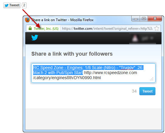
${item.getTweetButton("Check out this awesome gear!", "none", "large", "ultracart")} <br/><br/>
And if we actually tweet the above, here's how it would look on Twitter:
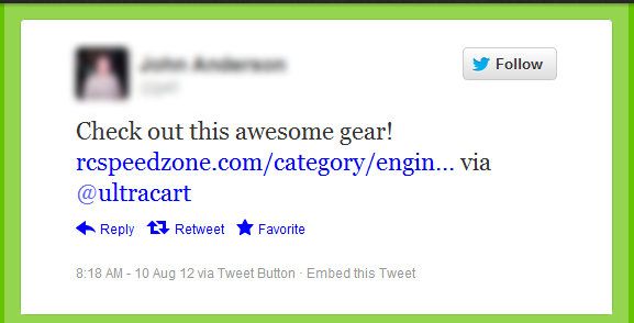
By including the via tag, you get the benefit of having your account mentioned and linked in the visitor's tweet. Pretty neat, eh?
Google+
If you have a Google account, then you also have a Google+ account. Congrats! The Google+ Button allows for a few customizations, but it tries to be much smarter than the other buttons. We'll discuss this in a moment. To create a default Google+ Button, just call the method without any parameters.
${item.getGooglePlusButton()} <br/><br/>
To customize the appearance, use the advanced method:
${item.getGooglePlusButton(String annotationType, int width, int height, String alignment)} <br/><br/>
- annotationType - Customizes what additional information is shown along with the button. Here are the options, as explained by Google:
- inlineDisplay - profile pictures of connected users who have shared the page and a count of users who have shared the page.
- bubbleDisplay - the number of users who have shared the page in a graphic next to the button.
- vertical-bubble - Display the number of users who have shared the page in a graphic above the button.
- none - Do not render any additional annotations.
- width - The maximum width the widget will expand to. Typically this is not needed, so unless you have a limited amount of screen real estate, simply pass in 0 to ignore it.
- height - How tall the widget should be. This also determines which button graphic is shown. Valid values are 15, 20 (the default), 24 and 60.
- align - Specifies the alignment of the components within the widget's space. This really doesn't do anything unless you've set a width value. Valid options are "left" (the default), and "right"