Element Settings
Every single element on a page has some form of settings that you can modify.
Opening the Settings Side Panel
Since there are numerous ways to get at the settings, let's view those now:
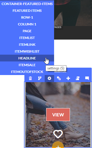
First you can hover over an element and click on the settings toolbar as shown below. Instead of clicking you can also hover over the element and hit "S" on your keyboard.
If the element is nested behind another element you can hover over the top element, hover over the settings icon, and then select the parent from the flyout menu as shown below.
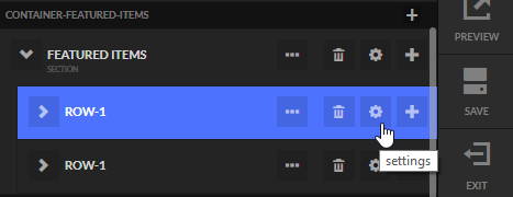
The final way of accessing the settings for a widget is by clicking the settings icon in any of the hierarchy related views as shown below.
Understanding the Settings Side Panel
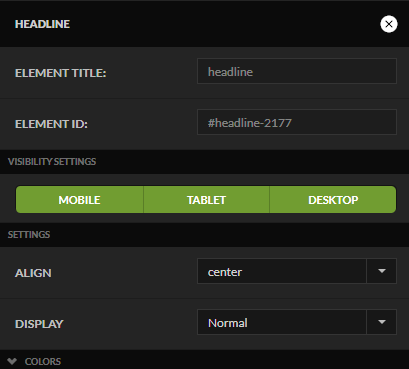
Every single element used by the Visual Builder has some form of settings. When the settings panel opens the top will look similar to this:
The type of element is displayed at the top, in this case a Headline. There is a X button to close the settings panel. You can also click back on the document or hit ESC to close the settings panel.
Every element has a title that will default to the type of element and can be edited. We recommend that you adjust the title to be meaningful. The title will display in the hierarchy and various other places within the Visual Builder.
Every element also contains a unique Element ID that can not be edited.
The next common setting that you will find on the page is the Visibility Settings. By default an element is visible on mobile, tablet and desktop.
To make an element visible only on a particular device type, click the button for the device(s) you want to disable. For example if we only want this element to be visible to desktop users we would click the Mobile and Tablet buttons. The screen would then look like this:
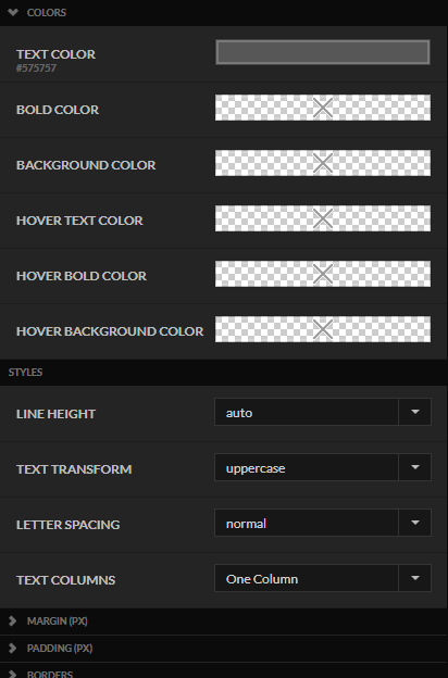
Depending upon the element, a variety of additional settings will appear. Settings are grouped into logical sections on the side panel with a title for each section. Let's look at a part of an actual settings side panel for a Headline element. In the screenshot below we can see a section for Colors, Styles, Margin, Padding, etc. Some sections can be expanded or collapsed. There is a chevron (arrow) icon beside the section title that you can click to expand/collapse that section.
The changes that you make to an elements settings appear immediately on the page. You do not have to save and refresh to see how a color, font, etc. will look on the page. It's truly WYSIWYG!
You'll encounter a few basic types of settings:
- text input
- color picker
- file picker
- slider (number)
- drop down
The inputs are easy and quick to manipulate. If you're not familiar with CSS terminology like Margin or Padding, just play with the setting and observe how the page behaves. You'll quickly manipulate the element into the desired look. Remember, that you see the change immediate and, if you don't like something just exit and reload the Visual Builder without saving.


