Overview
The UltraCart Storefront themes employ the Zurb Foundation 6 and leading responsive framework for dynamic presentation of web pages based upon the device screen size.
The Grid is an important part of the responsive layout functionality. The following video will demonstrate a number of ways to control the layout of your storefront pages.
Webinar Video covering The Grid
Understanding Small Medium and Large pages
The Visual Builder responsive framework is designed to automatically adjust to each device screen size. There are the devices views for each page build within the Visual Builder:
Small Screen
- Any Screen smaller than 640px wide
- Includes mobile devices, such as phones (Apple iPhone, Android devices, etc.)
Medium Screen
- Any Screen that is 640px or wider
- Includes Tablets (iPad, Kindle, etc.)
Large Screen
- Any Screen that is 1024px or wider
- Includes large HD tablets, laptops & desktop computers.
Typical screen layout
Let's take a look at how the GRID is comprised of a set of 12 columns.
The following picture is of a simple desktop (Large Screen) page structure:
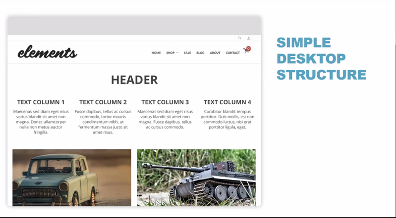
We have a page that has three rows:
A header followed by four columns of text, and under that, two side-by-side pictures.
So, let's examine the underlying grid structure to this page. In this view we can see the grid column structure more clearly:
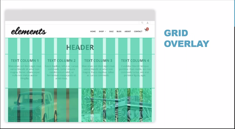
We can see that the entire page width is comprised of 12 columns, so let's take a closer view of how the three sections of the page are represented in the GRID column structure:
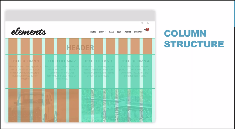
In this example, we see that this page has:
- A header section at the top that is comprised of the full 12 columns. (i.e. - 100% wide = 12 columns)
- The text column section that follows is comprised of 4 three column elements. (i.e. - 25% wide = 3 columns)
- And the two side-by-side pictures section is comprised of two 6 column sections. (i.e. - 50% wide = 6 columns)
| Width Percentage | Number of columns |
|---|---|
| 100% | 12 |
| 75% | 8 |
| 50% | 6 |
| 33% | 4 |
| 25% | 3 |
With this understanding of how the GRID columns apply the representation of elements in a page, let's now take a look specifically how this applies to the Elements theme you'll be working with in your storefront.
Here we see that we have a screenshot of the home page to your Elements theme home page.
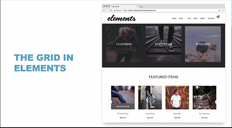
We three rows consisting of Sub-Group navigation followed by a Features Items Headline and then the featured items listing.
You can see these as three rows:
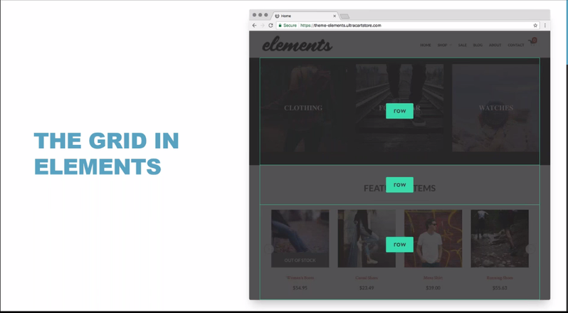
Now lets apply the Grid columns to these three element rows:
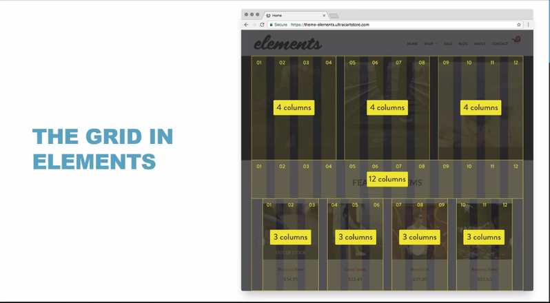
We see that the layout of these three rows are:
- First Row: Three sub-group elements that are 4 columns wide.
- Second Row: The Headline that is a full 12 columns wide.
- Third Row: The 4 featured item listings are 3 columns wide.
So, how is this represented in the Visual Builder interface? Let's take a look at soe of the ways that you can view your page structure in the Visual Builder.
Mousing-Over Element in Edit mode:
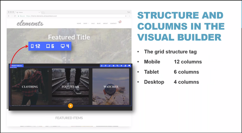
Whenever we hover over an element while in the edit mode of the Visual Builder, the element will be highlighted with a blue outline. In this outline the element type will appear in the upper left corner and the grid layout for each view will be represented just below the element type description, as seen above.
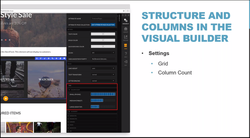
Upon clicking the Settings icon (or using the "s" hotkey while hovering over the element) a panel will appear along the right side of the page. In that panel a Grids section will provide a visual representation of the number of columns that apply to the element for the Small, Medium & Large views: