Mr Teas - Home Slider - Alternate Approach to Image Display
The default home slider works great for pictures, but due to the background cover approach used in the CSS, some of the image may be cut off depending upon the size of the image and the current dimensions of the device. The following tutorial will illustrate how some minor modifications to the home template and adding a few CSS classes can alter the home slider behavior.
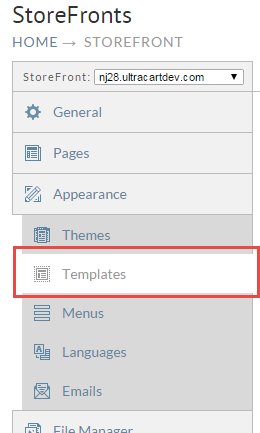
First click on the Templates tab on the left navigation as shown below.
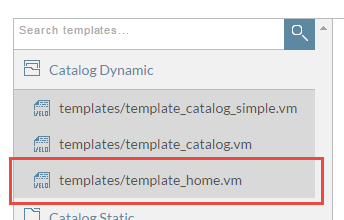
Expand the "Catalog Dynamic" folder and click on template_home.vm as shown below.
Now scroll down to around line 72 of the template until you see the highlighted block shown below.
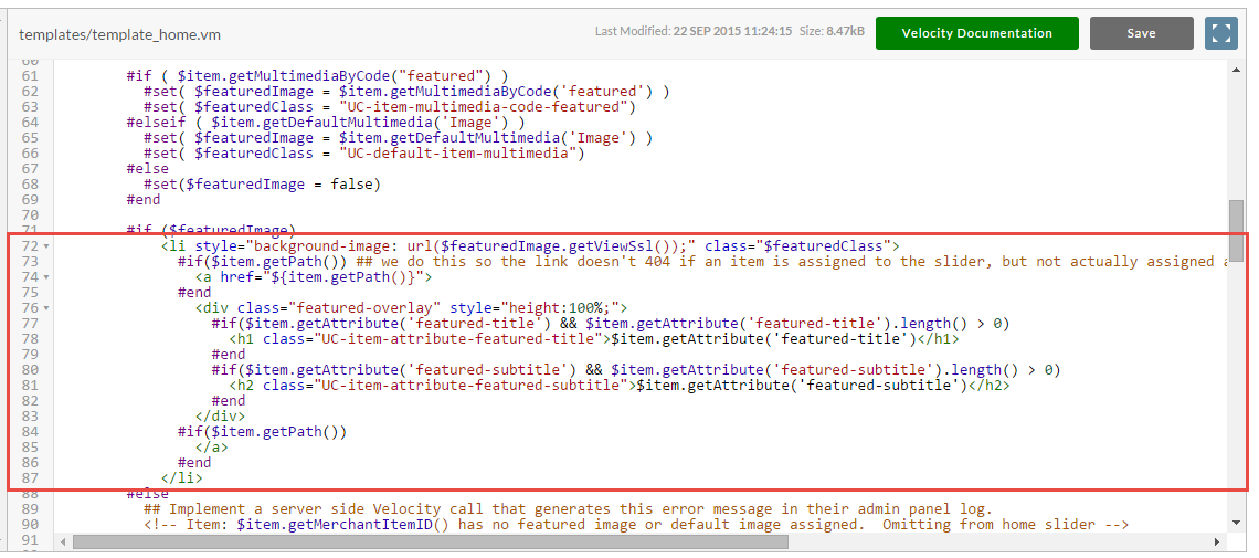
Replace that block with the following snippet of HTML + Velocity code. What we are doing is moving the image from a background image on the LI to an IMG tag inside of the LI.
            <li class="$featuredClass">
              #if($item.getPath()) ## we do this so the link doesn't 404 if an item is assigned to the slider, but not actually assigned anywhere in the catalog
                <a href="${item.getPath()}">
              #end
                <img src="$featuredImage.getViewSsl()">
                <div class="featured-overlay" style="height:100%;">
                  #if($item.getAttribute('featured-title') && $item.getAttribute('featured-title').length() > 0)
                    <h1 class="UC-item-attribute-featured-title">$item.getAttribute('featured-title')</h1>
                  #end
                  #if($item.getAttribute('featured-subtitle') && $item.getAttribute('featured-subtitle').length() > 0)
                    <h2 class="UC-item-attribute-featured-subtitle">$item.getAttribute('featured-subtitle')</h2>
                  #end
                </div>
              #if($item.getPath())
                </a>
              #end
            </li>
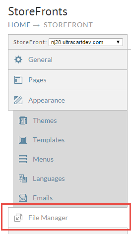
Once the change is made click "Save" in the upper right corner of the template editor. Now we need to move on to a few minor CSS adjustments. To do this we are going to override the CSS properly by editing override.css. Click on File Manager on the left navigation as shown below.
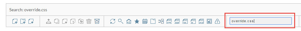
Now enter "override.css" into the quick search dialog as shown below.
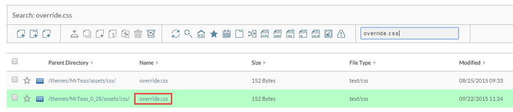
In the results pain, click on the override.css shown in green (the active theme) as shown below.
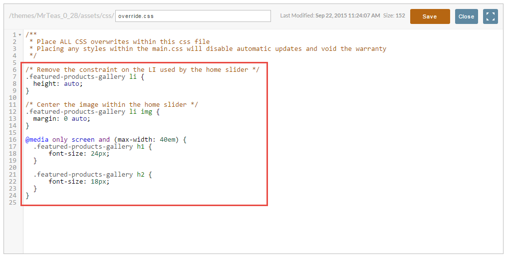
Now paste the following code into the file as shown below and click save.
/* Remove the constraint on the LI used by the home slider */
.featured-products-gallery li {
  height: auto;
}

/* Center the image within the home slider */
.featured-products-gallery li img {
  margin: 0 auto;
}

/* Reduce the font size of the home slider overlay text on small because the image will shrink in height */
@media only screen and (max-width: 40em) {
  .featured-products-gallery h1 {
      font-size: 24px;
  }
  .featured-products-gallery h2 {
      font-size: 18px;
  }
}
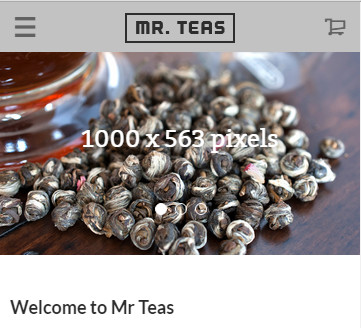
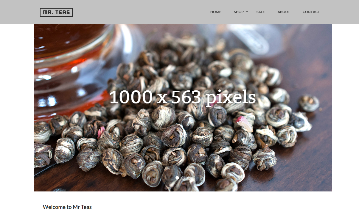
At this point the change is complete. People often ask, what size should I make the home slider image? Let's look at what the home slider will look like if the image is 1000 pixels wide by 563 pixels tall.
Large Format Devices (Desktop/Laptop)
Medium Devices (Tablets)
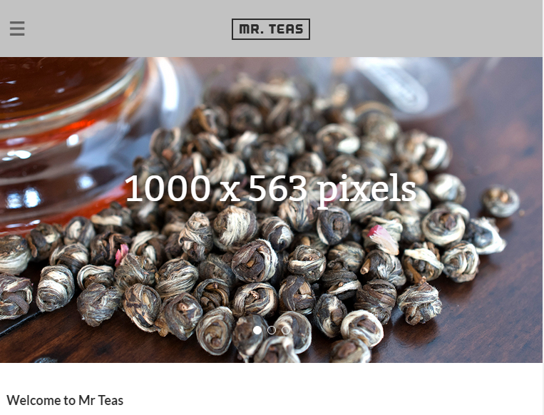
Small Devices (Phone)