...
Upon clicking the Settings icon (or using the "s" hotkey while hovering over the element) a panel will appear along the right side of the page. In that panel a Grids section will provide a visual representation of the number of columns that apply to the element for the Small, Medium & Large views:
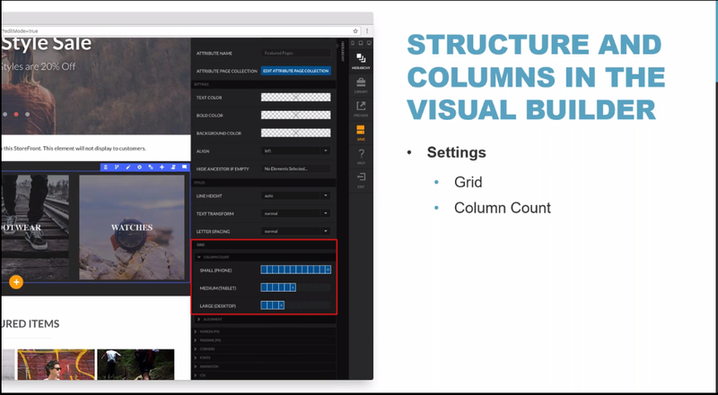
To change the column width for a device view, click into the sections to highlight the number of columns that apply (the selected columns will appear in blue.)
| Info | ||
|---|---|---|
| ||
Responsive page design assumes a "mobile view" first perspective. So, with the selected element, if we choose to make an element as 12 columns wide, then it will be 12 on "mobile" (ie - Small/Phone), then if you choose to define a different a width for either the Medium (Tablet) or Large screen views, you'll define those, as well did with this element (6 columns for Tablets and 4 columns for desktops). Keep in mind that you do not have to define the Medium and Large views, if you want to allow the mobile view to be inherited for the the Medium and/or Large device views. And if you only defined the Small and Medium device views, the Medium column configuration would be applied to the large devices. |