...
- A header section at the top that is comprised of the full 12 columns. (i.e. - 100% wide = 12 columns)
- The text column section that follows is comprised of 4 three column elements. (i.e. - 25% wide = 3 columns)
- And the two side-by-side pictures section is comprised of two 6 column sections. (i.e. - 50% wide = 6 columns)
| Width Percentage | Number of columns |
|---|---|
| 100% | 12 |
| 75% | 8 |
| 50% | 6 |
| 33% | 4 |
| 25% | 3 |
With this understanding of how the GRID columns apply the representation of elements in a page, let's now take a look specifically how this applies to the Elements theme you'll be working with in your storefront.
...
Now lets apply the Grid columns to these three element rows:
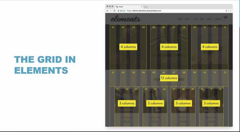
We see that the layout of these three rows are:
- First Row: Three sub-group elements that are 4 columns wide.
- Second Row: The Headline that is a full 12 columns wide.
- Third Row: The 4 featured item listings are 3 columns wide.
So, how is this represented in the Visual Builder interface? Let's take a look at soe of the ways that you can view your page structure in the Visual Builder.
Mousing-Over Element in Edit mode:
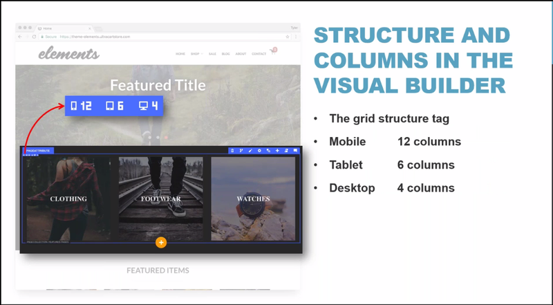
Whenever we hover over an element while in the edit mode of the Visual Builder, the element will be highlighted with a blue outline. In this outline the element type will appear in the upper left corner and the grid layout for each view will be represented just below the element type description, as seen above.
Upon clicking the Settings icon (or using the "s" hotkey while hovering over the element) a panel will appear along the right side of the page. In that panel a Grids section will provide a visual representation of the number of columns that apply to the element for the Small, Medium & Large views:
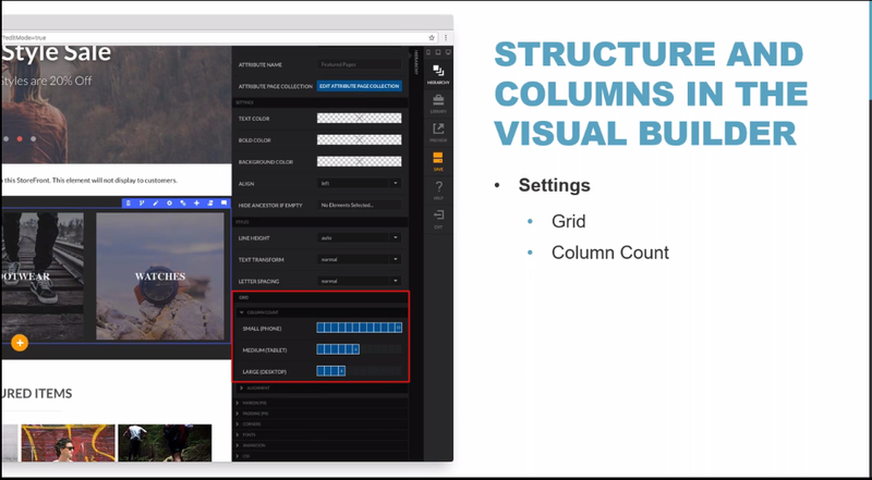
To change the column width for a device view, click into the sections to highlight the number of columns that apply (the selected columns will appear in blue.)
| Info | ||
|---|---|---|
| ||
Responsive page design assumes a "mobile view" first perspective. So, with the selected element, if we choose to make an element as 12 columns wide, then it will be 12 on "mobile" (ie - Small/Phone), then if you choose to define a different a width for either the Medium (Tablet) or Large screen views, you'll define those, as well did with this element (6 columns for Tablets and 4 columns for desktops). Keep in mind that you do not have to define the Medium and Large views, if you want to allow the mobile view to be inherited for the the Medium and/or Large device views. And if you only defined the Small and Medium device views, the Medium column configuration would be applied to the large devices. |