...
| Widget Connector | ||
|---|---|---|
|
Understanding Small Medium and Large pages
The Visual Builder responsive framework is designed to automatically adjust to each device screen size. There are the devices views for each page build within the Visual Builder:
Small Screen
- Any Screen smaller than 640px wide
- Includes mobile devices, such as phones (Apple iPhone, Android devices, etc.)
Medium Screen
- Any Screen that is 640px or wider
- Includes Tablets (iPad, Kindle, etc.)
Large Screen
- Any Screen that is 1024px or wider
- Includes large HD tablets, laptops & desktop computers.
Typical screen layout
Let's take a look at how the GRID is comprised of a set of 12 columns.
The following picture is of a simple desktop (Large Screen) page structure:
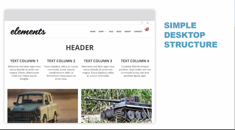
We have a page that has three rows:
A header followed by four columns of text, and under that, two side-by-side pictures.
So, let's examine the underlying grid structure to this page. In this view we can see the grid column structure more clearly:
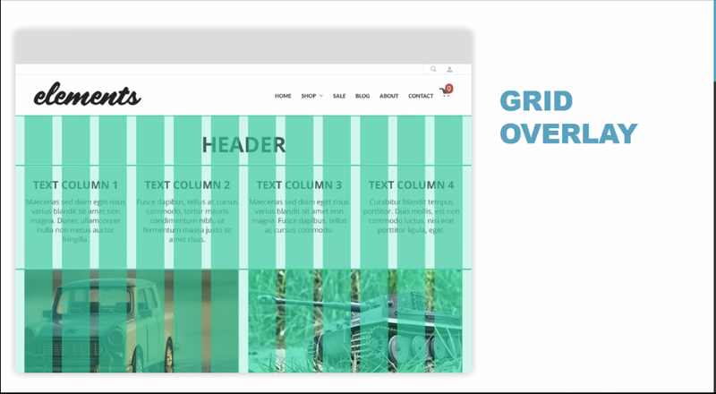
We can see that the entire page width is comprised of 12 columns, so let's take a closer view of how the three sections of the page are represented in the GRID column structure:
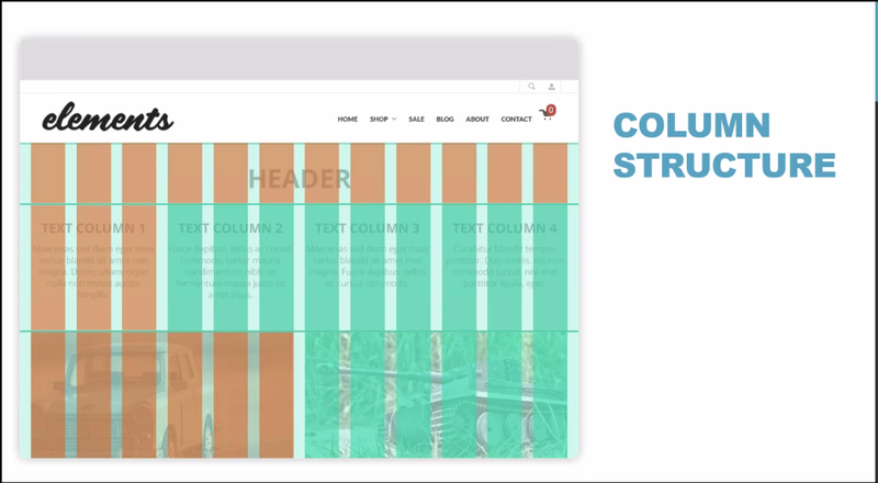
In this example, we see that this page has:
- A header section at the top that is comprised of the full 12 columns. (i.e. - 100% wide = 12 columns)
- The text column section that follows is comprised of 4 three column elements. (i.e. - 25% wide = 3 columns)
- And the two side-by-side pictures section is comprised of two 6 column sections. (i.e. - 50% wide = 6 columns)
| Width Percentage | Number of columns |
|---|---|
| 100% | 12 |
| 75% | 8 |
| 50% | 6 |
| 33% | 4 |
| 25% | 3 |
With this understanding of how the GRID columns apply the representation of elements in a page, let's now take a look specifically how this applies to the Elements theme you'll be working with in your storefront.
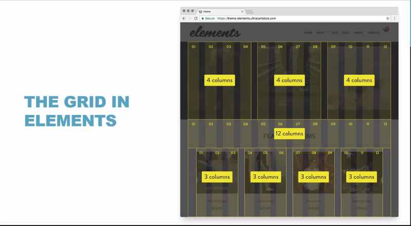
Here we see that we have a screenshot of the home page to your Elements theme home page.
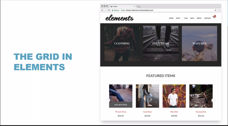
We three rows consisting of Sub-Group navigation followed by a Features Items Headline and then the featured items listing.
You can see these as three rows:
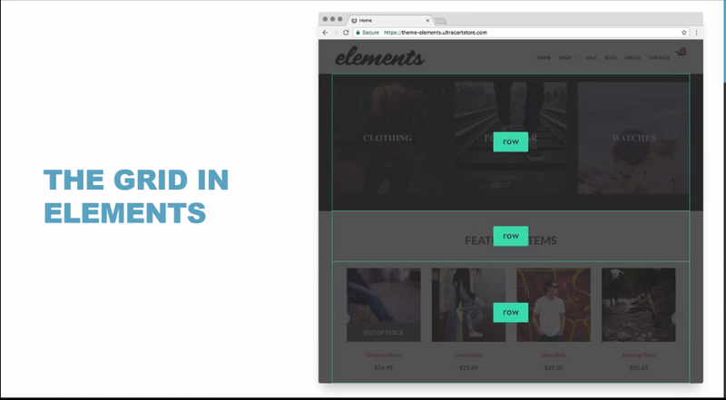
Now lets apply the Grid columns to these three element rows: