| Table of Contents |
|---|
Overview
...
We always want to make sure to start with the smallest first set first and then move to the css needed for larger displays.
| Code Block | ||
|---|---|---|
| ||
#main-header .company-logo img {
    max-width: 110px;
    max-height: 30px;
} |
| Code Block | ||
|---|---|---|
| ||
@media only screen and (min-width: 40.063em) {

  #main-header .company-logo img {
    max-width: 220px;
    max-height: 60px;
  }
} |
| Code Block | ||
|---|---|---|
| ||
@media only screen and (min-width: 64.063em) { #main-header .company-logo img { max-width: 220px; max-height: 60px; } } |
Override.css
So now that we know what css elements we are working with, we can now take this information and add in our own styles to the override.css file
| Panel |
|---|
Main Menu StoreFronts File Manager Search Override.css |
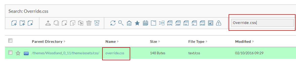
Simply click on "override.css" file name to edit the file. You should see the screen below.
Now that we have the override.css file open we can now add our new styles to change the CSS.

Now that we have saved our overrides we can go back to the site and inspect our logo again to see our changes in place.

| Note |
|---|
Please note that you may also need to make updates to the " .fix-nav #main-header .company-logo img " style as well. This style affects the image as someone scrolls down the page. There are also three (3) different styles to control this as well. |